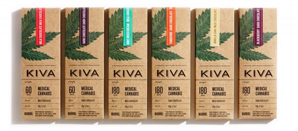
We have previously noted how Kiva Confection’s packaging stands out, and Anne Quito further explores the topic by conveying the perspective of Nathan Sharp, a graphics designer who was involved in the task of making the packaging attractive but yet compliant.
Sharp explained how important it was to make the bar’s medicinal content as clear as possible. With the bluntness of a drug label, delivered with the finesse of a graphic designer’s trained eye, Sharp (who collaborated with designer Jaime Lee) created a package to help guide Kiva’s customers who may be new to cannabis edibles.
Quito incorporates the perspective of Kiva co-founder Scott Palmer, who described the company’s desire to transcend the “weed culture” with its products.
The field is wide open and perhaps we can set a standard. Maybe grandiosely, we’re thinking if we can move the brand of cannabis itself.
Nathan Sharp

Read Anne Quito’s “Finally, marijuana packaging that doesn’t look like it was designed by a stoned teenager”: http://qz.com/622211/finally-marijuana-packaging-that-doesnt-look-like-it-was-designed-by-a-stoned-teenager/